A Numbers Game
Infographics and Page Layout Design
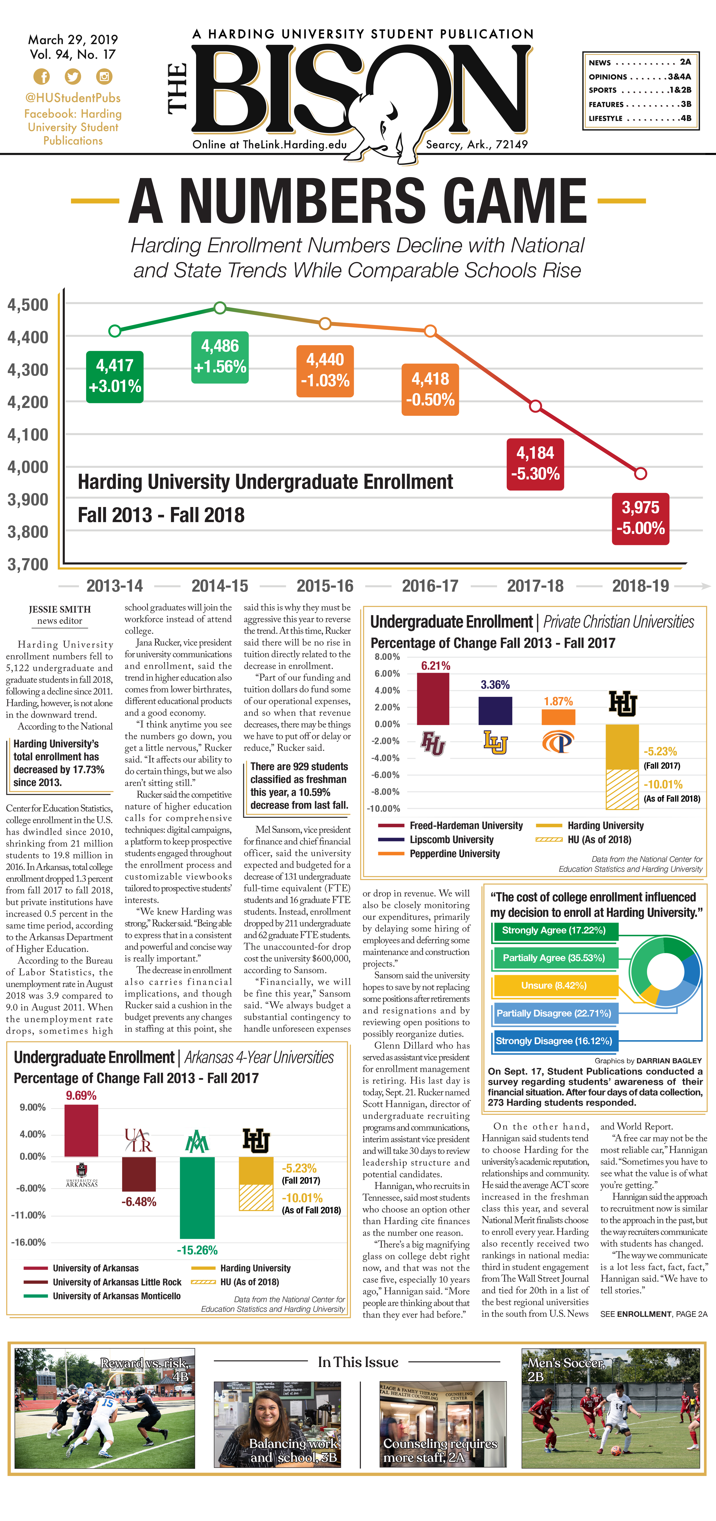
This front page story was about the recent trend in student enrollment decreasing at Harding University.
The Concept Behind the Cover
From the outset, we knew impactful infographics would be a key component of our enrollment coverage. The news editor and I began brainstorming data that would be relevant to the story. The charts we chose to include provide additional context and elaborate on information that wasn’t covered in detail within the story.

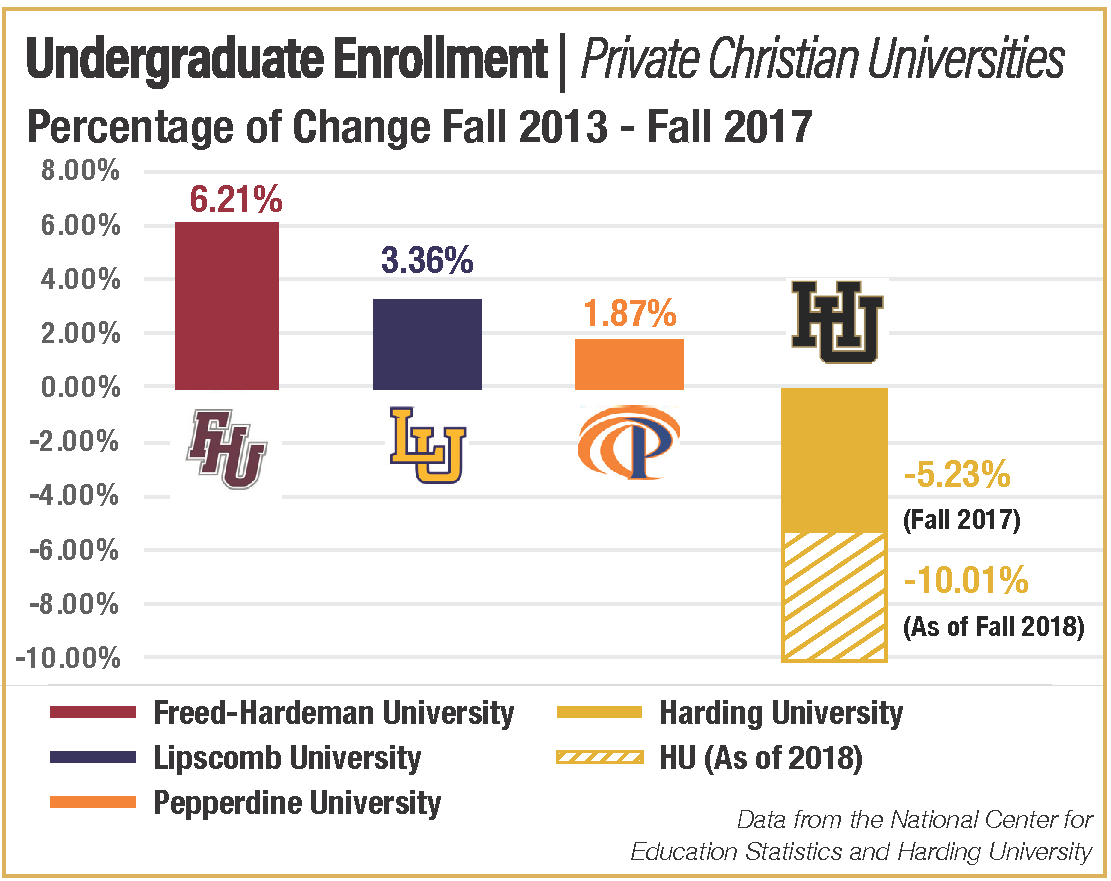
Why This Chart?
Context by Contrast
This bar chart contrast the decline with growth that similar Private Christian Universities have seen in the last 5 years.
Why These Schools?
These private christian universities are referred to as Harding’s “sister schools.” Students who apply to Harding often consider these schools.

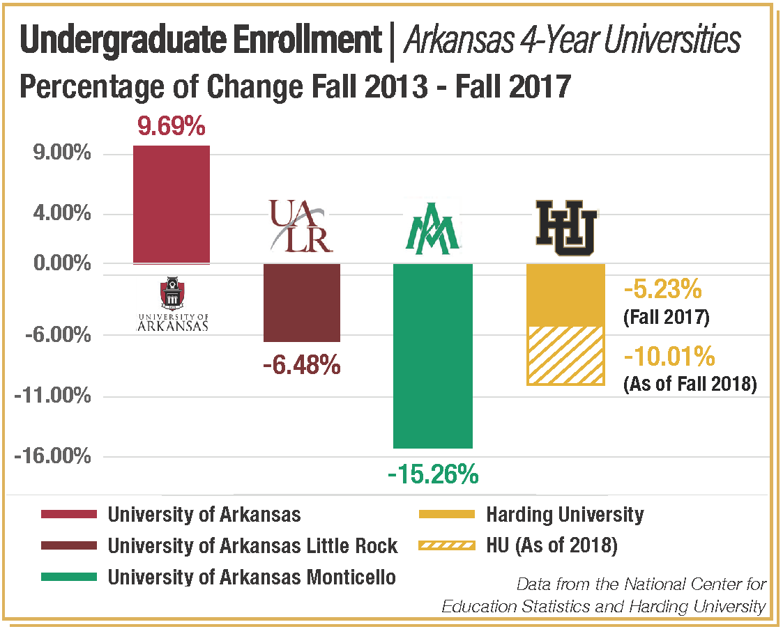
Why This Chart?
Context by Comparison
This bar chart visualizes that Harding’s enrollment is following the trend of other Arkansas un iverisities.
Why These Schools?
We chose these Arkansas 4-year universities to show that Arkansas schools have seen a wide range of trends over the last 5 years, despite the overal l decrease in undergraduate enrollment mentioned in the story.

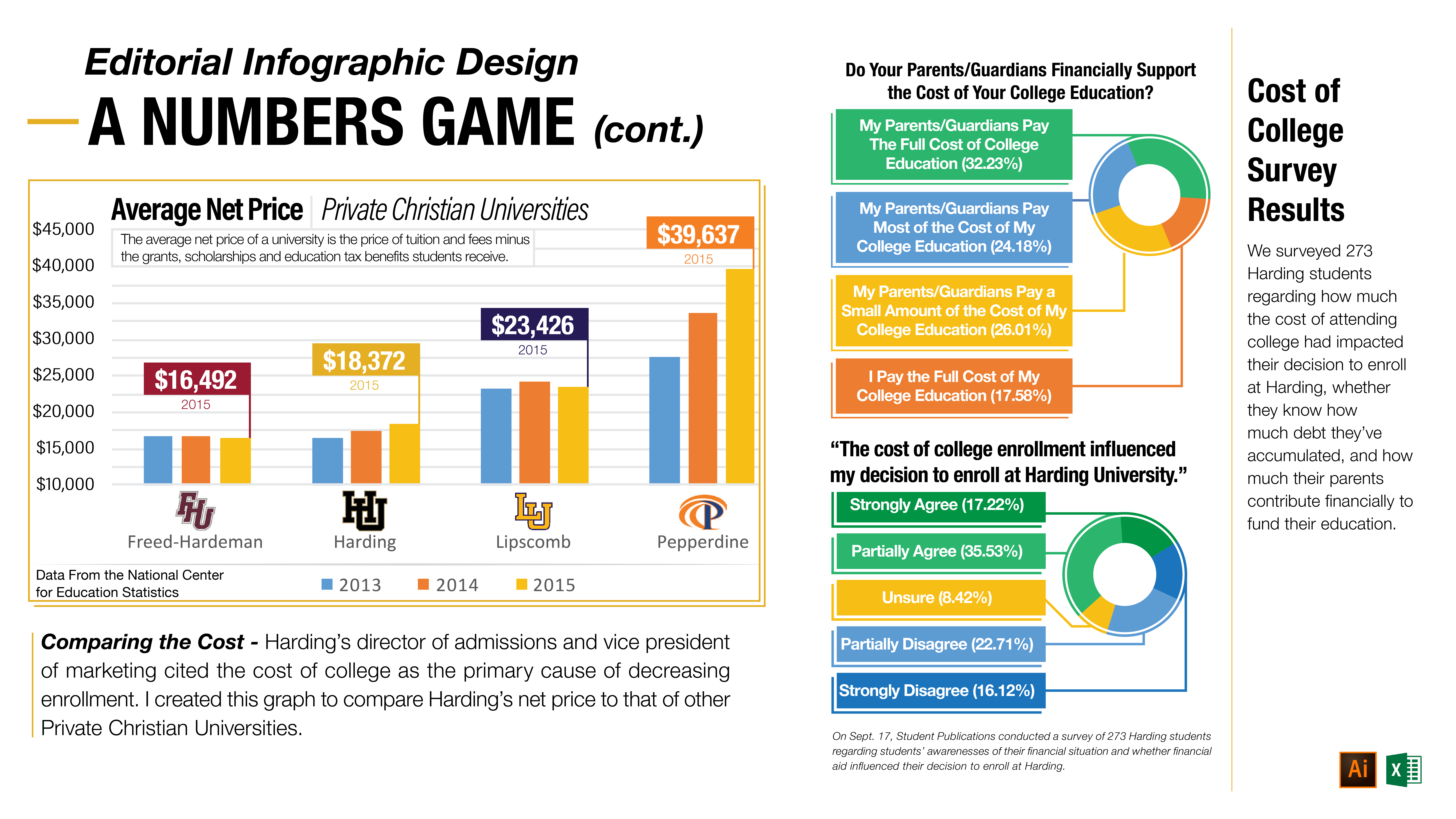
Why This Chart?
Comparing the Cost
Harding staff cited finances as a primary source of declining enrollment. This graph provides context for those claims by comparing Harding’s net price to that of the other private Christian universities. Each of these universities increased in undergraduate en rollment. While cost may be a large factor in Harding’s declining enrollment, this context prompts the reader to question why haven’t finances impacted other similar schools in the same way?
What’s the significance of these poll questions?
(Top) This data demonstrates the diversity of financial situations students are in.
(Bottom) This data provides more information regarding whether cost is likely an important factor in the decline.